Let’s talk a bit about website homepage layout.
This is the first thing that people see when they come to your website. It’s all about first impressions. If they like what they see (and can find what they’re looking for), they stick around. If they can’t, they are gone. And guess what? They’re not coming back.
There’s too much other information out there for people to find that if they don’t see what they want right away, they will look somewhere else. So it’s IMPERATIVE that you get it right.
What Should Be Included in Your Website Homepage Layout?
So what do you need to have on your homepage? Let’s make a list:
- A summary of what you do that people can understand in 5 seconds or less.
- An easy design that doesn’t take away from your message (colors, fonts, images, etc).
- Navigation that’s easy to understand
- A great headline
- Calls to action
- Keywords built around what you’re offering
- How it works…
- How to contact you, purchase, take advantage of offer, etc.
- Testimonials or Reviews
OK… now let’s go through OUR actual website and see what problems there are, which ones we hit, and which ones we missed. We’re going to look at our previous home page and the problems with it.
Also, after looking over our site analytics lately, I found out that 65% of the website traffic that lands at our Front Page, falls off. They leave the site without clicking on anything. They’re not finding what they’re looking for.
Our website average is around 20% right now (which is very good). But the front page is dragging us down and as one of our most viewed pages, that can’t happen.
Remember, in this post I discussed when we set up our business (Mancini Digital), we were so busy right away that our website did not ever take shape. We put the first draft out there and were too busy (from actual client referrals, not web referrals) to finish it. It’s actually VERY embarrassing for me to even talk about it right now because I sell my services every day to other people, but have not put it into play on our site yet.
I use this analogy all the time “It’s like the carpenter’s family living in a cardboard box”. The carpenter is too busy building homes for everyone else to build his own home. But I’m going to suck it up, swallow my pride, and tear my website apart in front of everyone. Let’s get started…
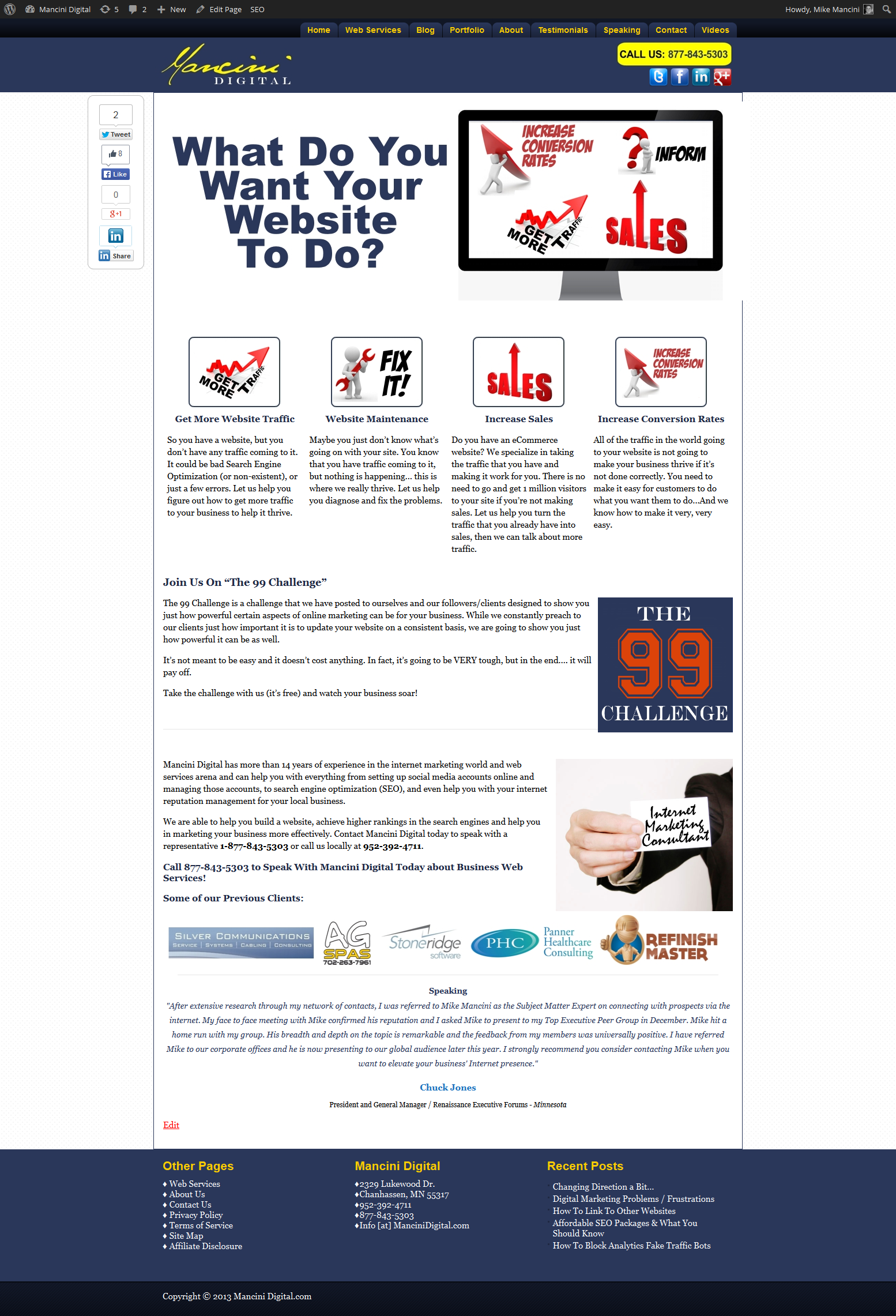
To the right is what the front page of our website looks like right now (click on it to enlarge it in a different screen).
First of all, let’s take a look at what is RIGHT with it and what is WRONG. In the next post we will fix the problems.
1. A summary of what you do that people can understand in 5 seconds or less.
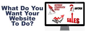
Our website summary is “What do you want your website to do?” with an image next to it of some possible answers.

What’s Right About It? – Nothing. It’s non-existent.
What’s Wrong With It? – EVERYTHING. “What Do You Want Your Website To Do?” is a headline and not a summary. There is no summary telling people what we do. Just an image with some of the things we do.
I talk about increasing conversion rates. A lot of people probably don’t understand what that means. Conversion rates of what? Pages, emails, what if I don’t know what a conversion is (in internet terms)?
Inform? That picture is self explanatory, I hope. But I shouldn’t hope. I need to redo that one.
Get more traffic? Sure, that one works and I think is very clear.
Increase sales. I need to say it! Not have a picture of the word SALES with an up arrow where people have to interpret what it means.
So, I need to redo that picture, or get rid of it completely. I ask a great question in the headline, but I don’t talk about how I can help them yet or exactly about what we do. There is no summary.
2. An easy design that doesn’t take away from your message (colors, fonts, images, etc).
What’s Right About It? – It’s very easy to look at. It’s not too jumbled, the colors all work together, and the fonts are good.
Readability in a website is paramount (font design and size). If people can’t read it easily, they are leaving. It’s not about what you THINK looks best, it’s about psychology and what works best for readership. Who cares what it looks like to you if other people can’t easily read it.
A good example is white font on a dark background. It may look cool, but after about 30 seconds it’s very hard to read. I’m also referring to the font of the majority of the written content (not headlines).
The easiest read font for your written content is Georgia. The best size (used to be 12). However as people get older it gets harder for them to read without zooming in. So I actually use a size 13.
I stick with psychology to tell me what works best and not what I think looks best.
What’s Wrong With It? – The same thing that was wrong with it in the first step. Images. The images are not clear. If you have to figure out what the image is saying, it’s not the right image.
3. Navigation that’s easy to understand

Mancini Digital Website Navigation Bar
What’s Right About It? – I think this one is OK. It’s very easy to see the navigation at the top. It’s not technical in nature. It let’s you know where to go to find exactly what you’re looking for.
What’s Wrong With It? –
Right now there are 9 choices. That may be too many. I will probably combine a couple of these into one page, or just get rid of them all together. One glaring problem is that I don’t have an FAQ page. A page where it’s answers questions like: What do you do? What is the process like? How long does it take? What is the cost? etc.
4. A great headline

Our Website Headline
What’s Right About It? – It’s clear? Asks a question to the reader to get them engaged? It always starts a good conversation when speaking to clients on the phone or in person. It really get’s them on the right page.
What’s Wrong With It? – Doesn’t tell anyone exactly what we do? (I could do this with a sub headline in the layout). So I could fix that easy. Another problem is that it’s never been split tested with anything else (this is a big no no in the marketing world).
5. Calls to action
What’s Right About It? – NOTHING! There are not ANY calls to action! OK… now I just want to go and bury my head under a pillow and scream. This is marketing 101. I guess I took that day off.
But that’s why I’m going through this. It’s one of the first things we talk to our clients about. Where are their calls to action? Once again, do what I say and not what I do…YET!
What’s Wrong With It? – EVERYTHING! There are no calls to action.
6. Keywords built around what you’re offering
What’s Right About It? -Very little. You know what… Nothing. I’ll explain in what’s wrong below.
What’s Wrong With It? – There are a lot of possible keywords around the page that have to do with what we do. Internet marketing, marketing your business, achieve higher rankings. But these are not the initial keywords that we built the page around.
Our main keyword was “web services”. However, when we did the page initially, the page was optimized for that keyword and it was doing OK (especially for such a difficult keyword). However, since then we have changed the content quite a bit and have not re-optimized the page for ANY keyword. Web service is still found, but it’s dropped off the map organically with the search engines.
Once again, embarrassment is washing over me.
Also, you can’t expect the entire planet to find the FRONT PAGE of your site with every possible keyword. It’s possible that people can find your site with multiple keywords, but you should just concentrate on one of them. Take other keywords and build other pages on your site around those. Don’t try to stuff all you’re keywords onto one page. It’s not 1998 when you could do this and rank for everything.
7. How It Works
What’s Right About It? – Once again… nothing! This exercise is starting to piss me off.
What’s Wrong With It? – There is NOT a process or how it works laid out for people. Do they have to take a number of steps? Is it a simple process or a long one? Let people know how to continue to the next stage of becoming a customer of yours.
8. How to contact you, purchase, take advantage of offer, etc.

What’s Right About It? – Yeah! We do have our contact information in the header (phone number), and full name, address, and phone number (NAP) at the bottom of the page. I also tell people to call us to speak with us about business web services.
What’s Wrong With It? – I’m not specific enough. When I tell people to speak with us about business web services, I don’t say to find out more, to purchase, to get a free estimate. It’s too vague and doesn’t offer a solution to any problems the visitor may have.
9. Testimonials or Reviews

Website Testimonial or Review
What’s Right About It? – Once again, we did do this OK (but this was just implemented about a week ago). We gathered up a number of testimonials and added a section to the site. We also have various places around the site that rotates testimonials so people can see what others have to say about our business.
Testimonials and reviews are becoming more and more important EVERY day when it comes to building your business online.
What’s Wrong With It? – I could have it stand out a bit more and be more prominent. Right now it sort of blends into the background.
Conclusion
The conclusion is; “That was ridiculously painful!” It would be one thing if I was just to take this exercise myself and not publish it. But to find all of these problems with my site and then put them out there for the world to see, is even more painful… but necessary. Our website homepage layout has failed in so many ways.
It’s necessary to show you that we do know what we’re doing. We just sometimes get caught up with other things… like running our business. Does that sound familiar?
Stay tuned for our next post when we actually make those changes to the front page and see what it looks like.
UPDATE! – CLICK HERE for the changes that we made to our Website Homepage.


